Using content elements effectively
Content elements are used to build your page content. You can add content elements to any page, except for Assets and Layouts pages. When you open the editor and place your cursor on an empty line, you will see that the "Add content" (+) icon becomes active. Click the icon to see a list of available content elements.
Using content elements is fairly straightforward, but we have some tips and tricks available to help you get started.
Content elements
In Kadanza, we have the following content elements available (*)
- Main and sub-navigation
- Edge-to-edge banners
- Heading (h1-h6),
- Quote, Lead, and Paragraph text styles (system fonts, Google fonts or own Adobe Fonts license)
- Ordered and unordered lists
- Links
- Images
- Cards (visual shortlinks)
- Color element
- Button
- Dividers
- Embedded elements (Video, Figma, Storybook)
(*) We're constantly improving our platform, so new content elements or more specific functionalities will be added
Main navigation
The main navigation is the 1st level of pages in each space. The main navigation is a horizontal navigation menu located at the top of your installation.
We recommend not adding too many items in the main navigation, as this makes it harder for a user to find his way around the platform.
In the main navigation settings, you can define how the navigation will look like. You can define height, color, fonts for links (default and hover), ... You can also choose whether or not to show the support icon in the main navigation.

Tips:
- In the page settings, you can hide a page from the navigation menu. When a page is hidden, it will not appear in the navigation, and users can only access the page by using a direct link.
- If the Home page is hidden, it can be accessed by clicking the space logo located at the top left of the navigation.
Sub-menu navigation
The next navigation level is created with the sub-menu navigation. Kadanza can provide up to three levels for sub-pages.
Sub-pages are added in a folder, a content page itself can not have sub-pages.
The look and feel of the sub-menu navigation can be defined in the content element settings. Styling includes menu background, hover state, buttons, fonts,...

Tips:
-
If your installation has different spaces, and the same pages are used across spaces, we recommend giving the pages a different name and navigation name. The navigation name is what users will see in the main pr sub-menu navigation, while the name is what admins see when they are linking to a page. Having different names makes linking easier when there are a lot of similar pages.


Headings (H1 - H6)
There are different heading styles that you can use in your Kadanza installation. In the component settings, you can define the font and style of each heading individually

Tips:
- H1 is always used on the Assets and Layouts page as title, you can not change this to any other heading. So keep this in mind when deciding on heading hierarchy.
- If you want to use a special heading to use on colored banners, we recommend using one of the lower hierarchy heading styles, like H5 or H6
Lead and Quote style
Lead and quote elements are specific content elements to create lead text and quotes.
Lead text can be used as introduction text, or to create more eye-catching text between paragraphs. Quote elements are created specifically to use for quotes and statements in paragraph text.
In the component settings, you can define the font and style of each heading individually

Images
Image can be placed in an image component. In the component settings, you can define several parameters, such as the roundness of the frame, stroke size and color and the styling of the caption text.
Images added in an image frame are uploaded to the space uploads folder. In the Assets extension (in the Admin console) you can find all uploaded images on the uploads page. Admins can delete images from this page, but keep in mind that once the image is permanently deleted, it will no longer be visible in the image frame. So be cautious when deleting images from the Uploads tab.
Tips:
- When an image is placed, you can change its size with the drag handles next to the image
- In the settings panel below the image, you can change the alignment
- The imapge options allow you to
- Add a link to the image when clicked
- Zoom images when clicked
- Hide the caption (and the whitespace)

Layouts
The Layouts element is used to create content columns. When placed, admins can decide between different column options. Inside each column, other content can be placed. When you place the cursor in a column you can select from the available content elements. Not all content can be used in a column, adding other columns for example is not possible.
Tips:
- You can add multiple elements below each other in a Layout column. Keep in mind that the columns are placed below each other in smaller windows. If you cant to keep certain content together, use different Layout components below each other.
- You can choose how the content is aligned vertically per column.
- With the "add content after" icon in the Layouts element settings (the 1st icon on the left), you can add a new content element right after a Layouts element.
Links
There is a special component for creating links. While you can not place a link directly on a page, you can create links from different content elements. The same link options are available for each compoinent that you want to add a link to.

You can create different types of links by selecting the desired type from the link options dropdown.
- URL: add a url to an external site
- Page: by entering 3 characters, Kadnaza will suggest pages matching the characters you entered. Select the desired page to create a page link.
- Email: in this field you can add aan email address.
- File: when elected, you can upload a file, which will be stored in the uploads folder. When users click the link, the file will be downloaded (or opened in a new tab, depending on your browser).
-
Entry point: when selected, you can configure the desired entry point. The configuration options are similar as when configuring an assets page, but when the link is clicked, a modal will open showing a modal with the connfigured entry point.


Tips:
- When creating a link, you can choose if it opens in the same or a new tab. We recommend using new tabs when you let your users navigate away from your Kadanza installation (external urls).
- Outside the editor you can see an anchor icon next to headings. When clicked, a link to this heading is copied to your clipboard. You can paste this in the url option to create a shortlink to this heading on a Kadanza page.
Edge-to-edge banners
Edge-to-edge banners are a great way to create more visually appealing pages. You can place a banner anywhere on a page, and you can place other content (like layout columns, text, images,...) inside the banner
Use it to highlight important text and titles at the top of the page or as a footer or in-page content element. By combining the banner component with other components, you can have many options, such as showing Figma designs in a wider view and working with several columns by adding a layout component.

Tips:
- In the banner settings, admins can define the default height of a banner. If you want a specific banner to be larger, you can put the cursor in the banner and hit enter to enlarge the banner.
- The image uploaded in a banner will behave differently on different screen sizes. Use the alignment and cover/contain options to become the ideal setup.
- You can add animated gifs in a banner.

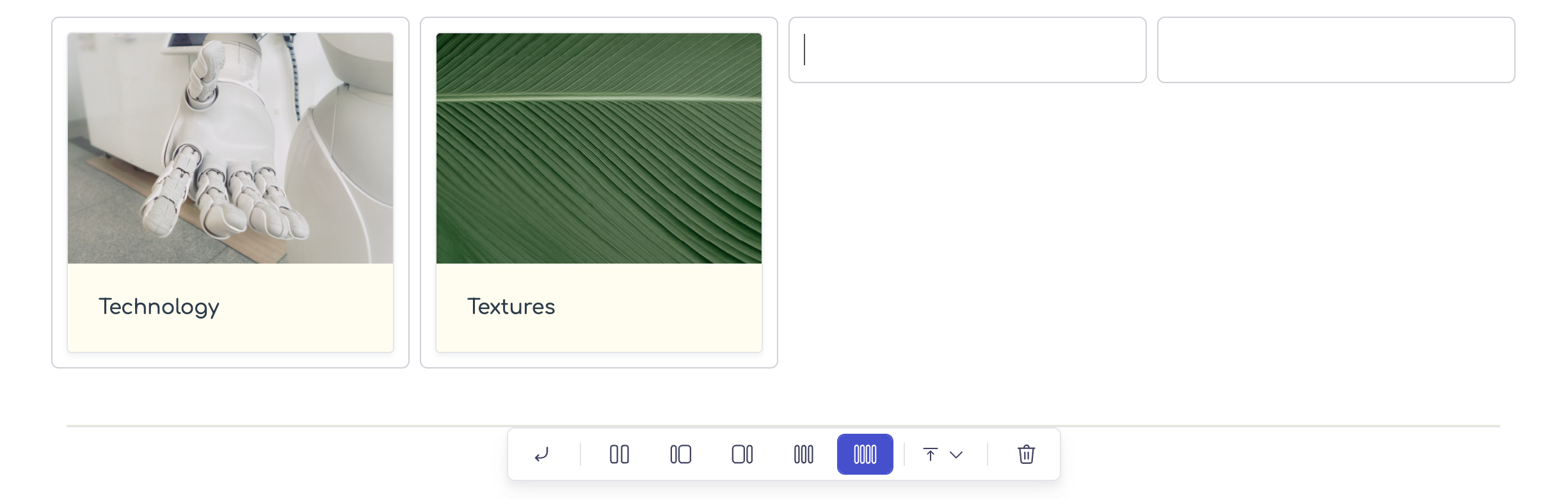
Cards
Cards are content elements that are mainly used for creating visual links to other pages, categories, content,... A card typically has an image (static or animated), a title and a subtitle

In the card settings, you can define how ythe background colors work by default and on hover, the size and stuyle of title and sub-title,... When a card is placed on a page, admins can decide to hide the title or the subtitle, or to hide the text box and show the text directly on the image.
Tips:
- Cards will stretch horizontally to fit the frame. If you would like to use small cards, place them inside a four-column layout component.
-
When you have different text lengths for each card, the size of each card will be different. When cards are placed next to each other, the bottom end will not align. Select "Full height" in the card options to make sure the card can use the full height of the column in which it is placed

Then select "stretched" in the layout column alignment optinos. This will make each card equally high (see image above)


Color component
Color components are special elements to create a list of color values. You can add different color types and list each value individually. The color preview will be generated by the #HEX color value entered in each line.
In the color component settigs, you can define the style of the fonts used for color name and value rows.

Managing the colors is also very easy. You can choose which color values you want to include and then enter the desired values.

Tips:
- When listing multiple colors, four will be visible per row. The 5th color wil appear on a new row.
- If you are unhappy with the color order, you can drag the color to a different position using the drag handles next to the color preview
- If you want to add text in between color cards, use separate color components for each subset.
Button
A button component is a simple component that you can use to create links that are visually more appealing than regular text links. In the component settings, you can define the roundness, color (default and hover) and text style.

Tips:
- Use buttons for very specific and recurring link types, such as "'download our logo", or "Go to next page"
Embedded video
You can add videos to your content pages. These videos need to be hosted on an external platform such as Vimeo, YouTube, or Dailymotion. When you add the “Embed video” content element to your page, you can paste the link to the video.
In the component settings, you can set the margin above and below the embedded video. All viewing tools (like the "play" button and the sound options) are managed via the url you entered.

Tips:
- If you can't upload the video to an external platform, there is a little trick to host it directly in Kadanza:
- Add an image element on a page
- In the element, upload the bvideo you want to use. You can not select the video for the image component, but you can upload it
- Go to the admin console, Assets extension > Files page
- In the "Uploads" tab, find the video you uploaded and select "Embed asset" from the context menu
- Copy the embed link
- Add a video element on the page and paste the embed link in the video source field
Embedded Figma
You can share your stunning graphics and illustrations with your users by choosing “Embed Figma” and adding the link to your design. In the component settings, you can set the margin above and below the embedded Figma. All viewing options are managed via the Figma file.
Please keep in mind that access to the file is managed inside Figma. Kadanza users who are not allowed to see the file because of viewing restrictions will see an empty frame.

Embedded Storybook
Storybook is a tool for digital guidelines. Similar as Figma, you can embed your Storybook easily by using the Storybook embed url. In the component settings, you can set the margin above and below the embedded STorybook. All viewing options are managed via the Storybook settings file.
Please keep in mind that access to the file is managed inside Storybook. Kadanza users who are not allowed to see the file because of viewing restrictions will see an empty frame.
